Interactive HDI Dashboard: Multidimensional Data Analysis & Visualization
- Home
- Portfolio Details

Maximized Transparency, Enhanced Control, and Data-driven Decisions
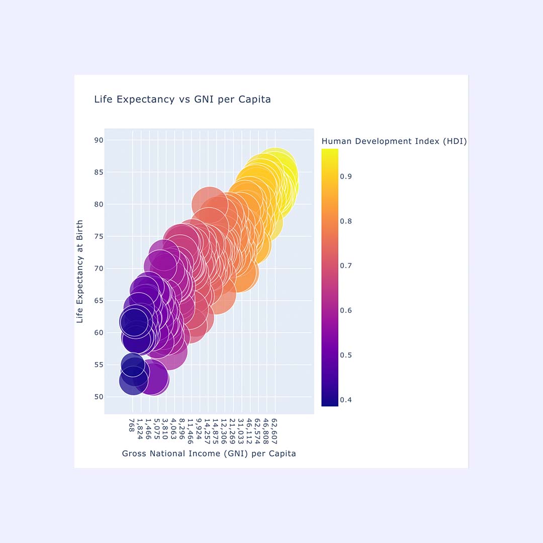
For a global research initiative, we developed an interactive dashboard that visualizes core development metrics such as Life Expectancy, Gross National Income (GNI) per Capita, and the Human Development Index (HDI) in one dynamic, multidimensional view. The goal: make complex relationships instantly understandable for NGOs, analysts, and policymakers alike.
By combining color scales, bubble sizing, and interactive filters, we created an intuitive tool that reveals correlations, uncovers anomalies, and enables data-driven decision-making.
Development of an interactive dashboard (Python / Plotly)
Data aggregation and multidimensional mapping
Color coding and size variation for comparative insights
User interaction: hover, zoom, and dynamic filters
Responsive web integration
With the HDI Dashboard, we turn complex global data into accessible insights – supporting research, reporting, and policy development.
Interested in visualizing your data in a way that speaks for itself? Let’s talk about your custom dashboard solution.
Contact us today to discuss your customized dashboard!