Energy Performance Dashboard
- Home
- Portfolio Details

Visualizing production, consumption & self-sufficiency in residential energy systems
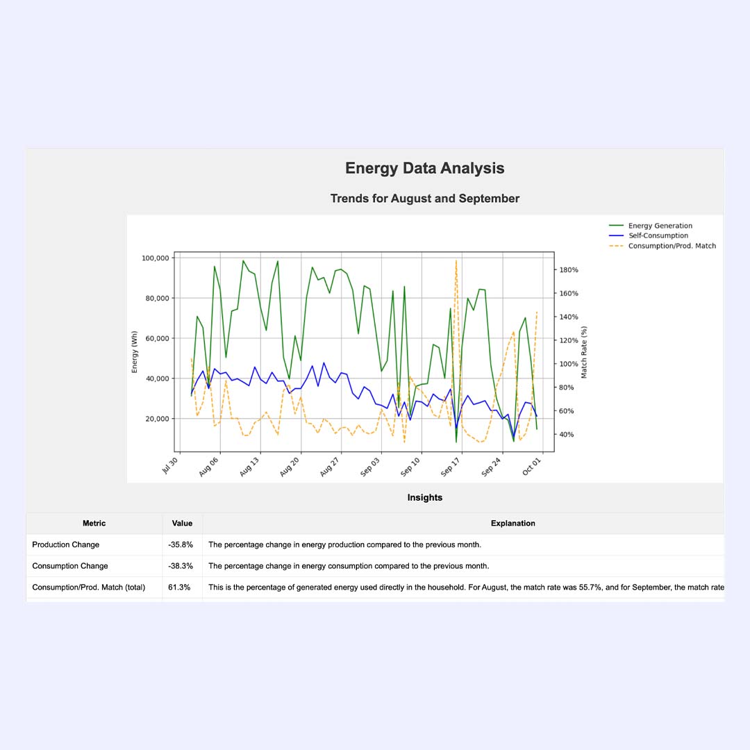
This dashboard provides a clear visual overview of energy generation, self-consumption, and match rate across time. Developed to help households or energy consultants analyze consumption behavior, it reveals inefficiencies and guides optimization decisions in self-sufficient energy systems (e.g. solar).
By visualizing data for August and September, the dashboard identifies trends and deviations in production and usage. The dynamic line chart displays:
Below the graph, a quantitative insight table summarizes key metrics such as:
With actionable metrics and clear visuals, this tool helps energy-conscious users make informed decisions on how to improve their energy efficiency and storage strategy.
Looking to visualize your energy data?
We build tailor-made dashboards for solar projects, smart homes & beyond.