Education & Income Dashboard: Quadrant-Based Policy Insights
- Home
- Portfolio Details

Visualizing the interplay of education and national income through a multidimensional lens
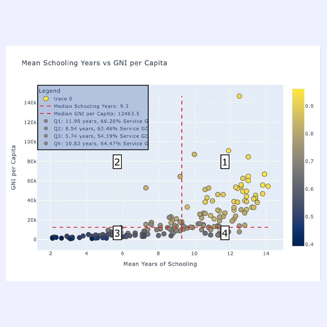
We developed an interactive data visualization tool that maps the relationship between mean years of schooling and Gross National Income (GNI) per capita across countries. The dashboard uses a quadrant logic to segment countries based on the median values of both variables, enabling fast identification of development patterns and strategic focus areas.
Each country is represented as a color-coded dot based on its Human Development Index (HDI). The result is a visually intuitive breakdown of how education and income interact—highlighting countries that outperform, underperform, or remain developmentally imbalanced.
By combining color scales, bubble sizing, and interactive filters, we created an intuitive tool that reveals correlations, uncovers anomalies, and enables data-driven decision-making.
Dynamic quadrant segmentation using median lines
HDI-based color mapping for an added development dimension
Rich tooltips with extended data (e.g. % GDP from services)
Responsive layout for embedding in presentations or reports
Developed using Plotly Dash and Python data pipelines
By combining statistical clarity with interactive design, this dashboard enables institutions, NGOs, and analysts to pinpoint where investments in education or economic reform will yield the greatest impact.
Interested in transforming your public data into clear, actionable insights?
Let’s build your next interactive dashboard!